
I'm getting ready to work on some things for my handmade booth I rent out monthly. I've stocked it full with rosette necklaces in the past. I plan on upgrading those puppies a little bit come this spring. I love this color combo above - and I see it everywhere! Coral and aqua? Do you like it? It's gorgeous to me!
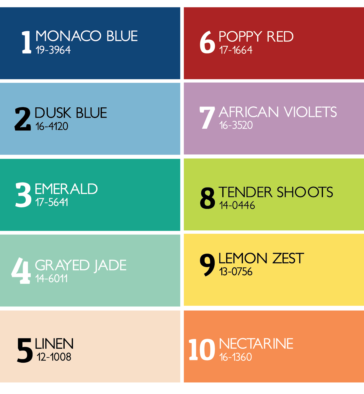
Since Pantone released the color report for Spring 2013, I've been thinking about colors I want to use this Spring. Emerald, Tender Shoots, and Grayed Jade are my favorites. Which ones do you see yourself wearing this year? I've seen a lot of Poppy Red and Monaco Blue paired together in the stores!
 |
| source |
Pantone LLC, a wholly owned subsidiary of X-Rite, Incorporated, is the world-renowned authority on color and provider of color systems and leading technology for the selection and accurate communication of color across a variety of industries. The PANTONE® name is known worldwide as the standard language for color communication from designer to manufacturer to retailer to customer.


2 comments:
I really like the lemon zest and African Violets. My wedding colors were yellow and lavender. I also like the tender shoots. I did my daughters room in greens and purples... so I am a fan of that combination too!
Oh! I love anything aqua and coral!! I think they both look gorgeous with grey/silver tones too. The color block is great, I'm so happy you shared that! I really like the grayed jade and linen...they'd be great together with the Monaco blue and poppy red!
Post a Comment